SETTLE, is a fictional brand that supports people in finding sustainable housing in specifically the Netherlands. For this concept, the visual language was designed and applied.
Why this logo and tone of voice?
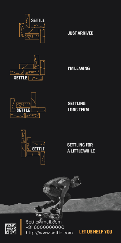
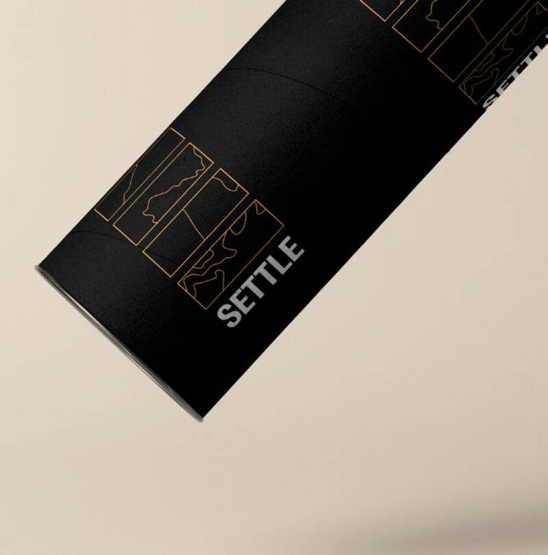
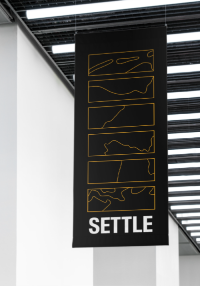
The logo is dynamic depending on when it is used (like short term or long term) and is based on the Netherlands’ borders. It also resembles how people try to settle and feel at home, brick by brick.
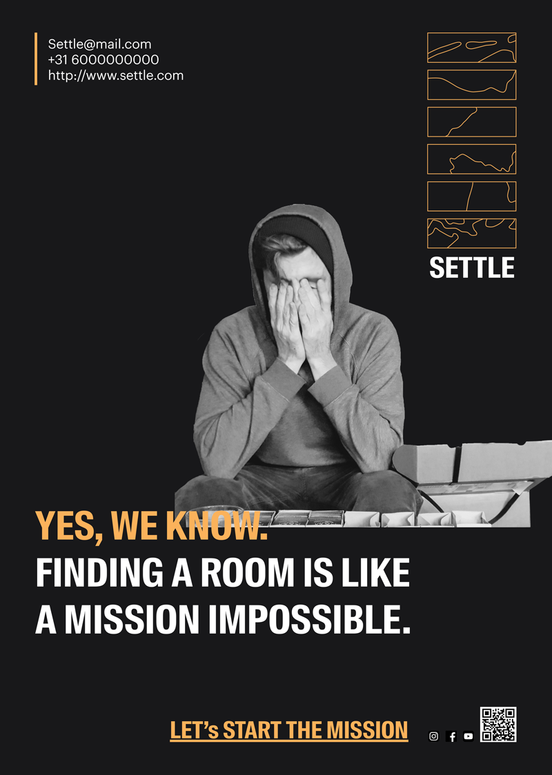
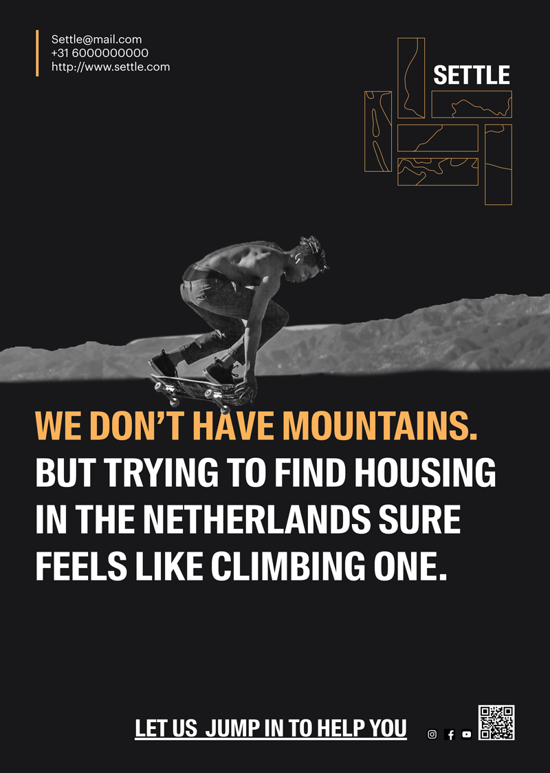
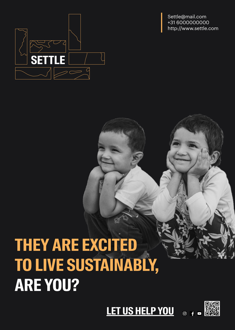
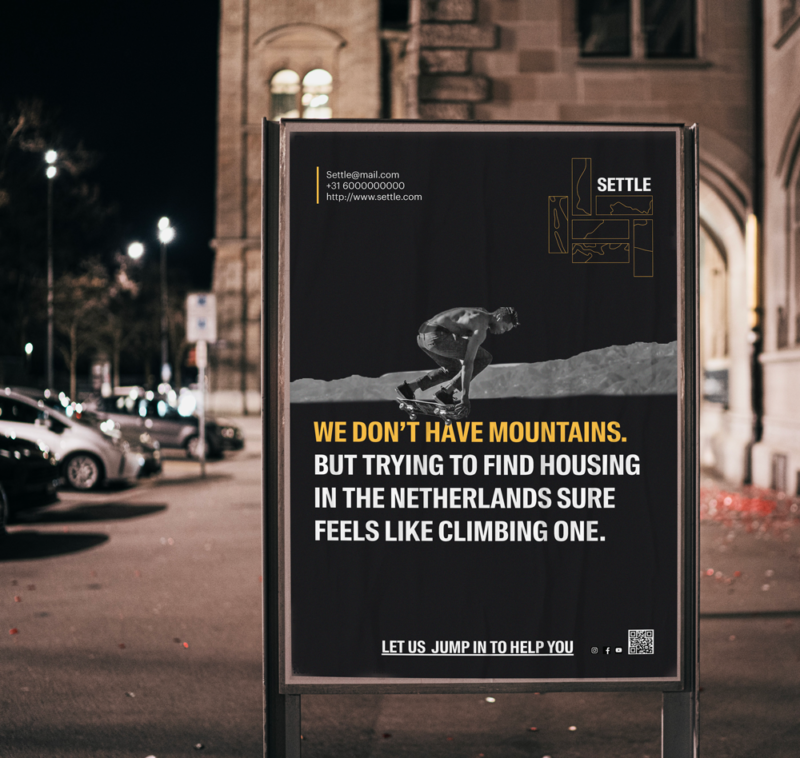
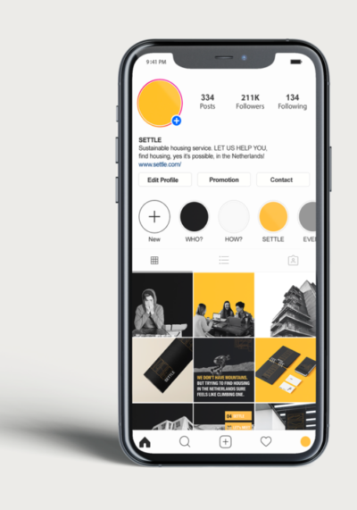
The tone of voice is humouristic, because moving to
a new country is daunting enough. For the same reason, the popping friendly yellow color was used, which was initially inspired by the Dutch national orange colour.
It was chosen to move slightly away from that into the encouraging yellow. It creates an inviting feeling, and it contrasts with other companies in The Netherlands.