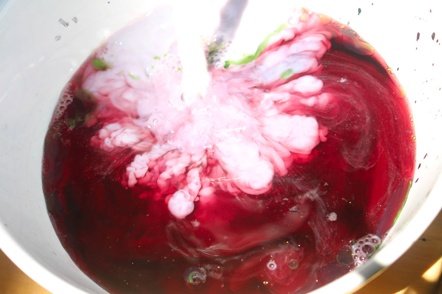
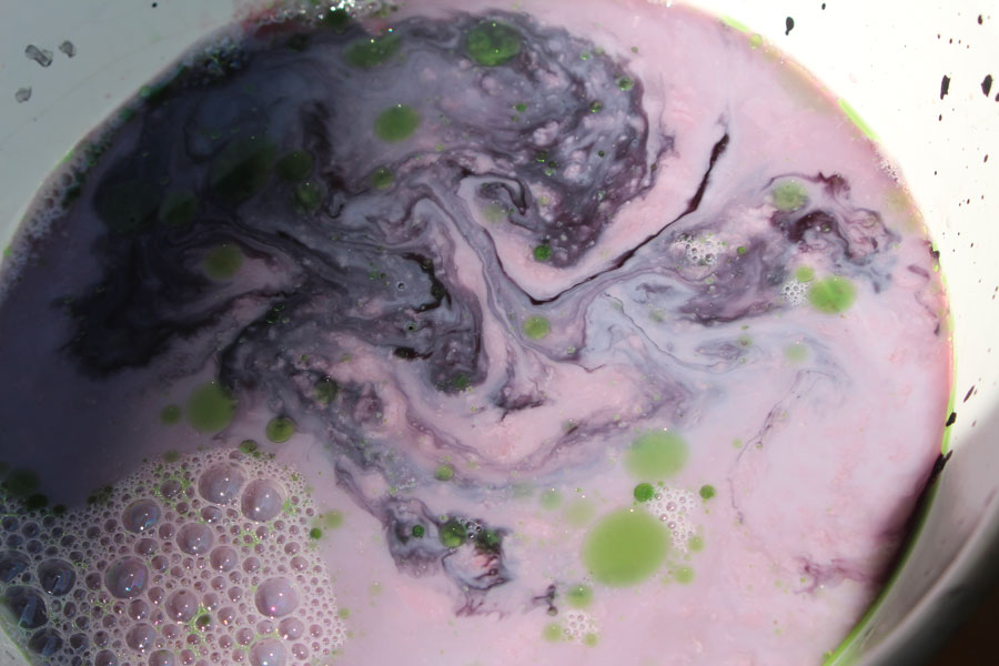
Intervention Design - Rethink Routine - Visual Language
What is it?
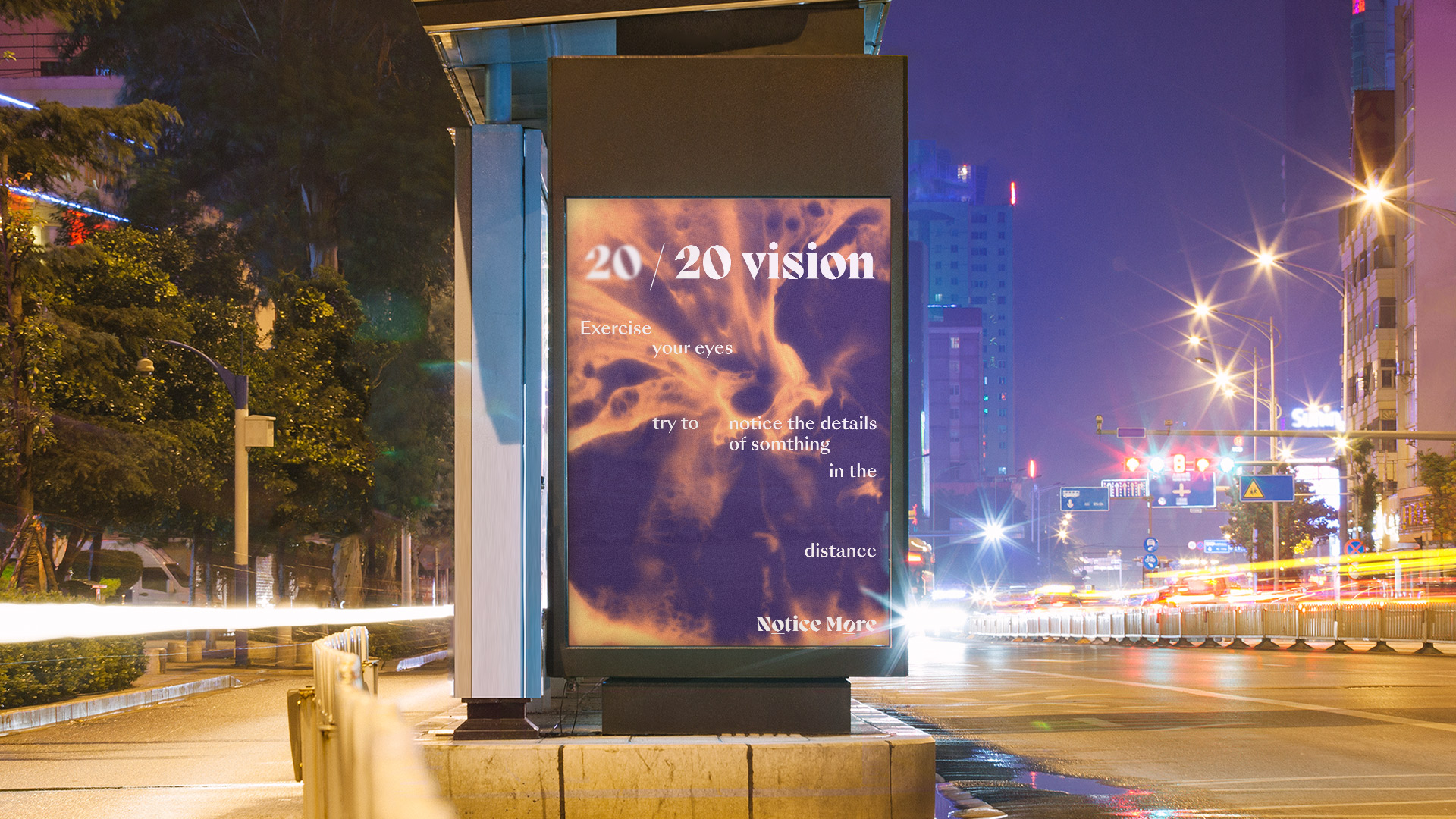
"Notice More is an encouragement for people to use practical tools that makes them live a more conscious, aware and intentional life.”
Project Partner: Dan Highwood
Why tools?
Tools are optional, and do not force. These tools encourage you to mindfully and consciously think about your own life, routines and thoughts. But you decide when you will be encouraged.
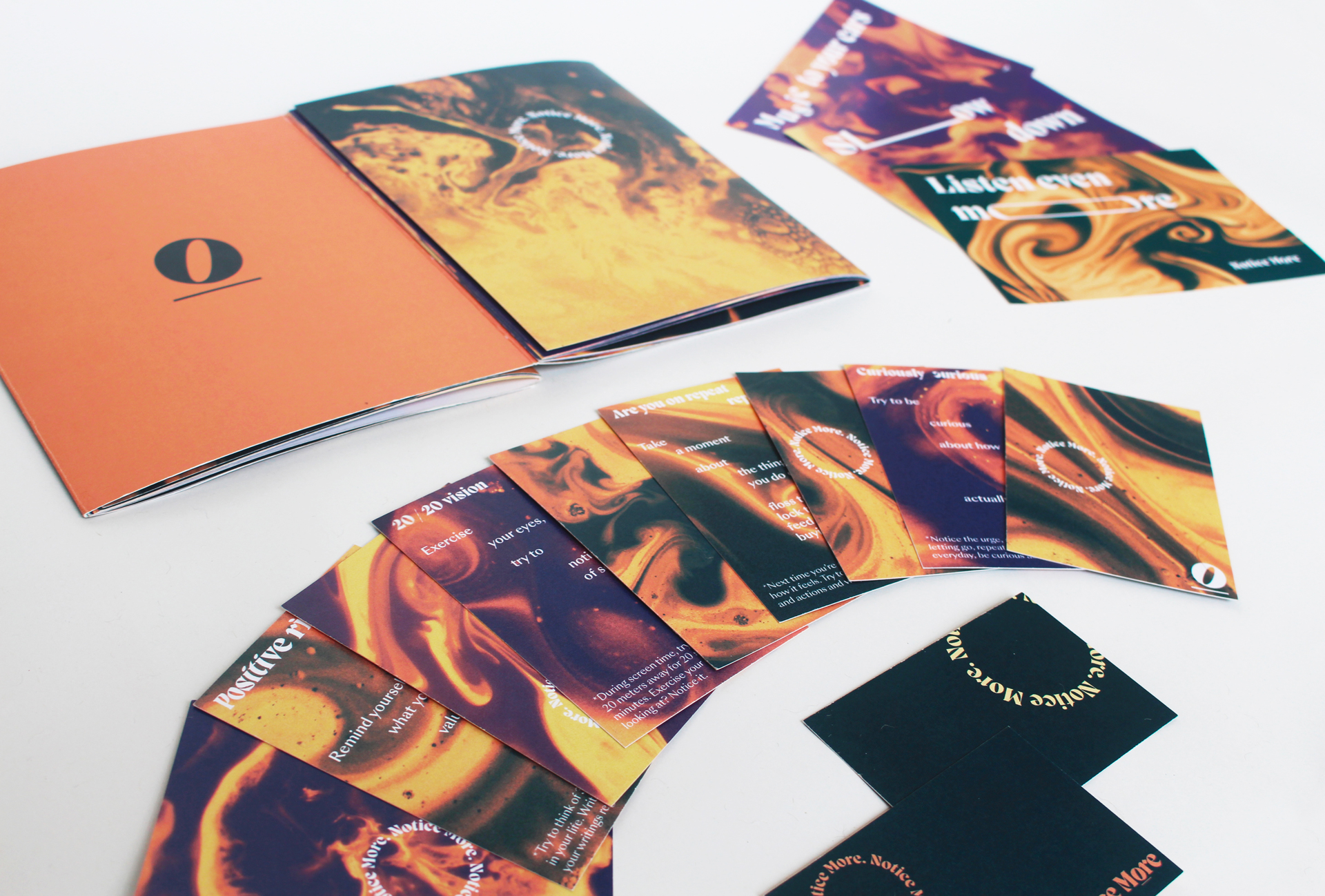
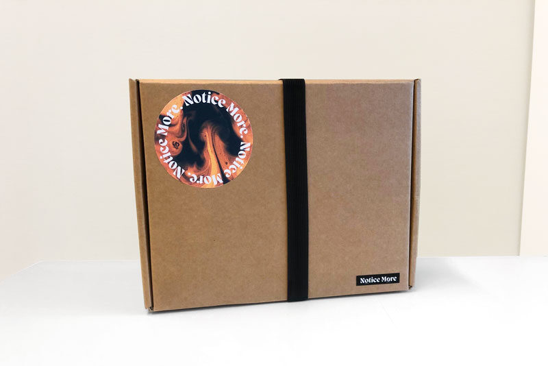
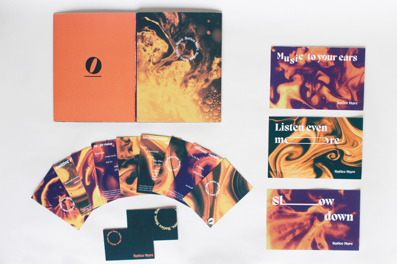
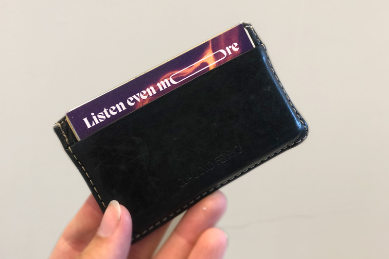
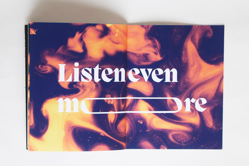
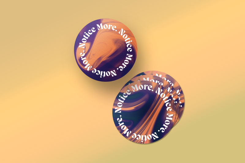
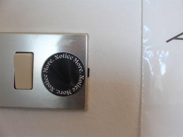
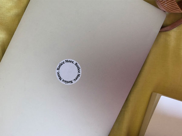
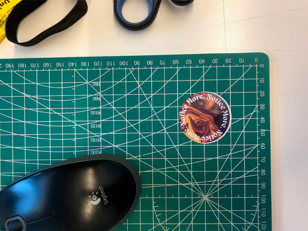
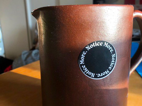
You are basically given cards with small assignments to do in your own time, plus a set of stickers to choose where in your personal space you need a reminder.
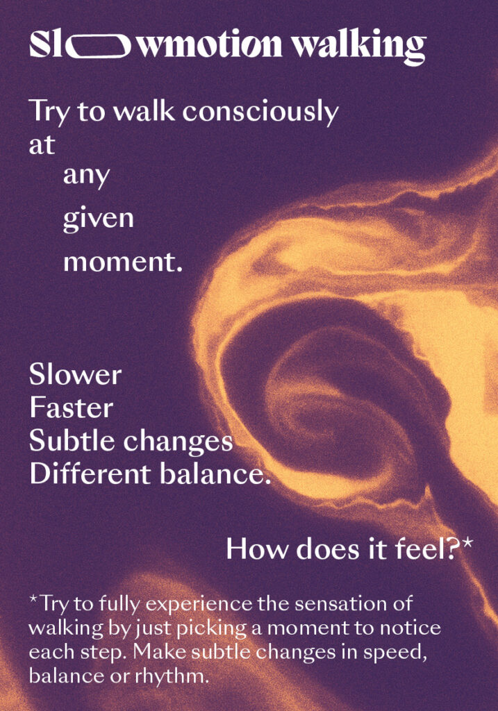
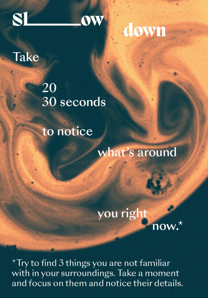
Far too often in life, we just go with a flow that might not completely be the ideal speed for us or it might make us flow past things without noticing them. We believe that noticing, makes you rethink your daily life and potentially rethink your daily flows. Eventually, you might realise some changes might do you good.
These changes are very individual and personal, and people shouldn't be told how to change their own lives. The only thing we can do is give them the right tools to discover their patterns and learn about themselves in their own way.
Why tools?
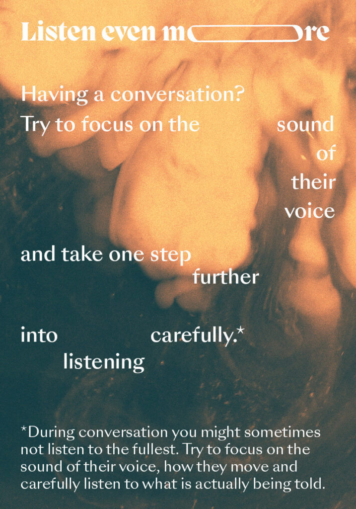
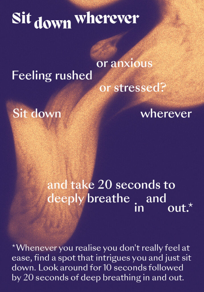
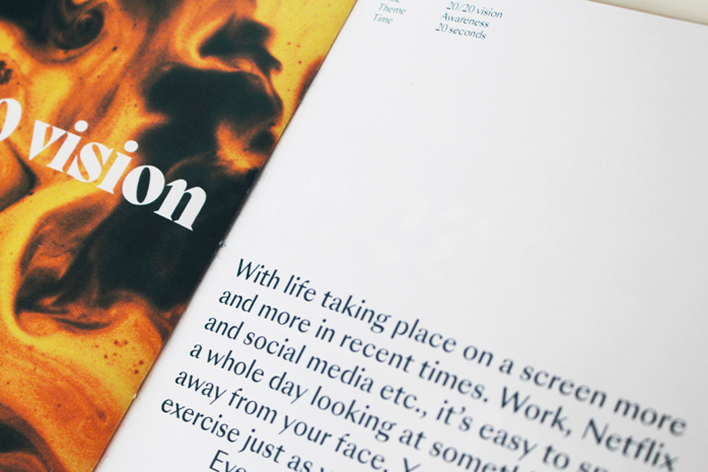
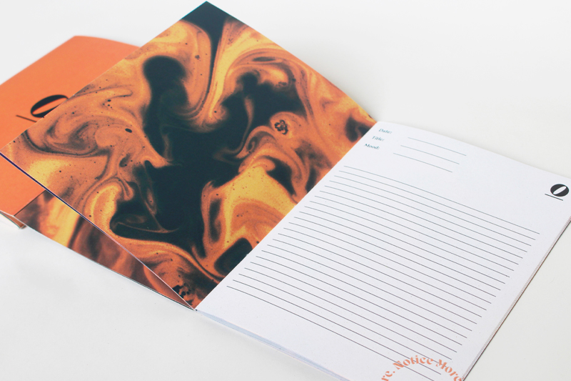
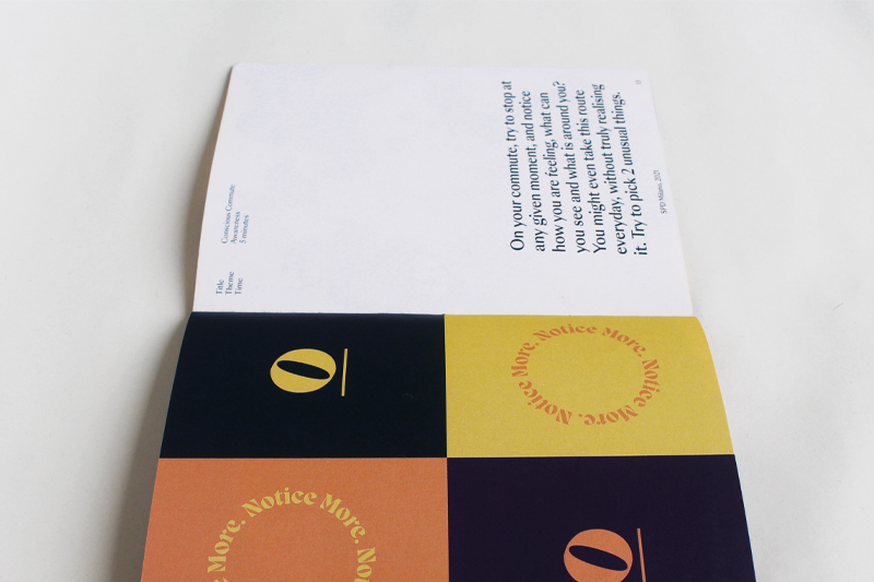
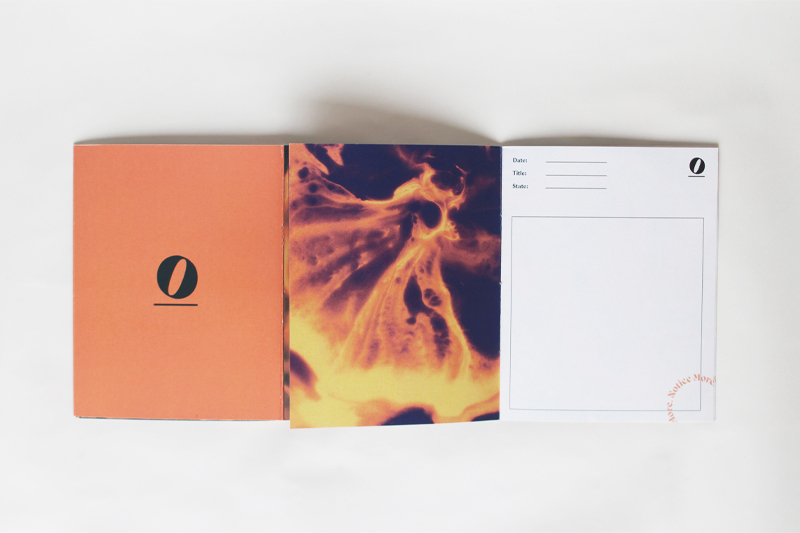
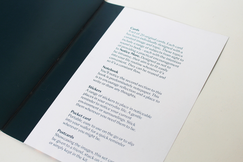
For this reason, a set of cards was designed with content based on mindfulness practices. On the 20 cards, small tasks are displayed to help you practice "noticing more". The tasks are inspired by mindfulness practices.
The text is placed in different layouts on each card, to make you reflect more on the meaning.
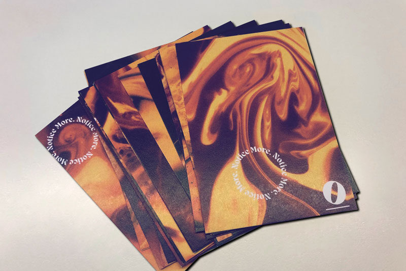
By giving people a set of cards, you give them the power to decide what technique they find most suitable for themselves. Also a set of stickers, a reminder card to put in your wallet and postcards are added to the box, in order for people to completely personalise their process of "noticing more".
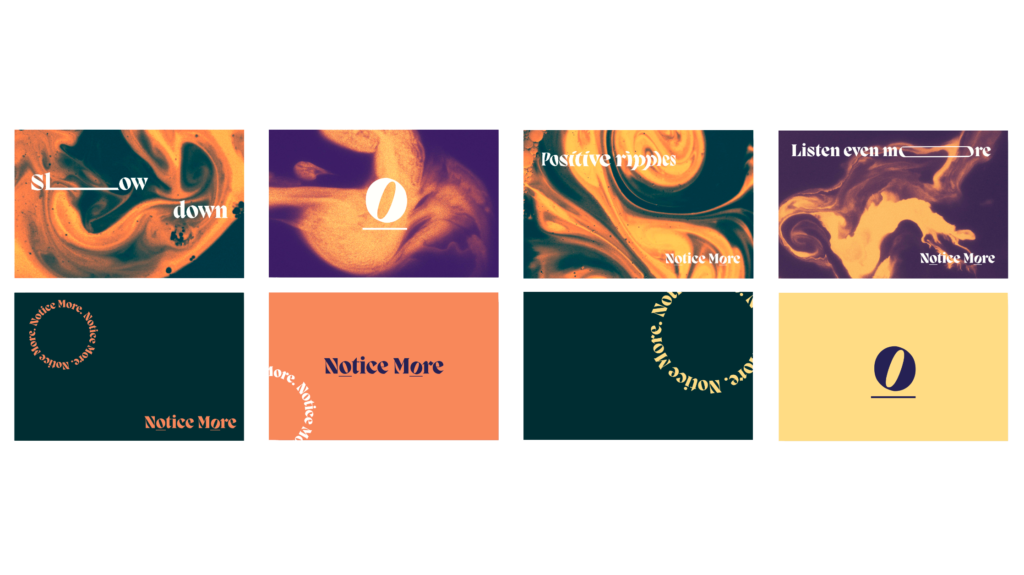
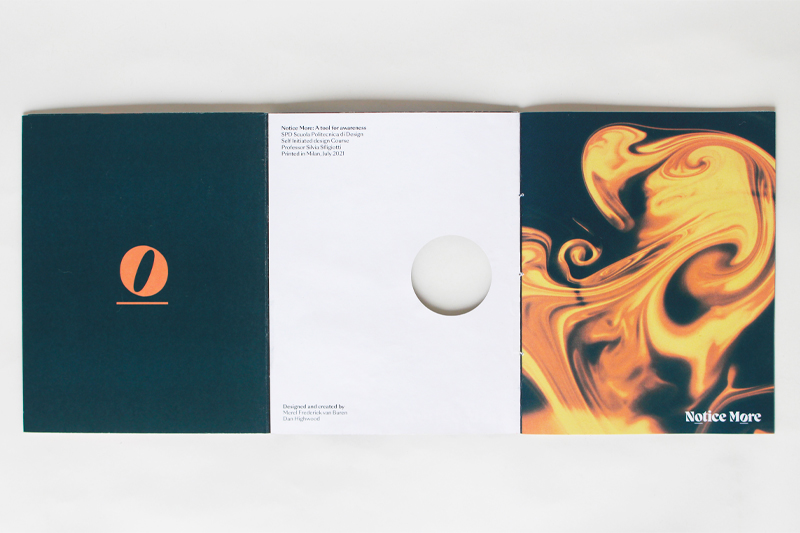
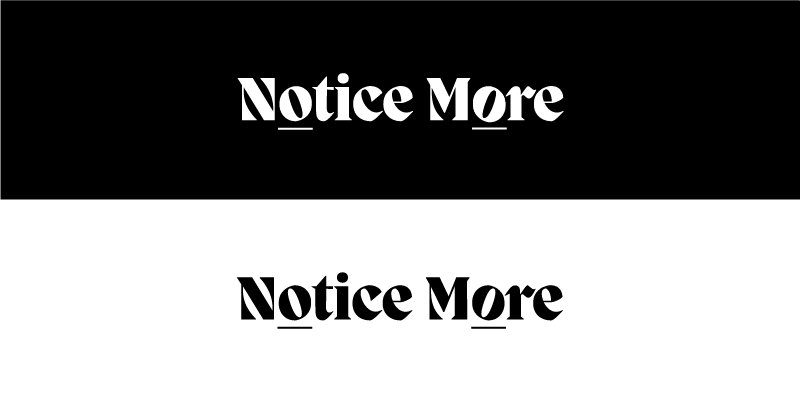
Why this logo?
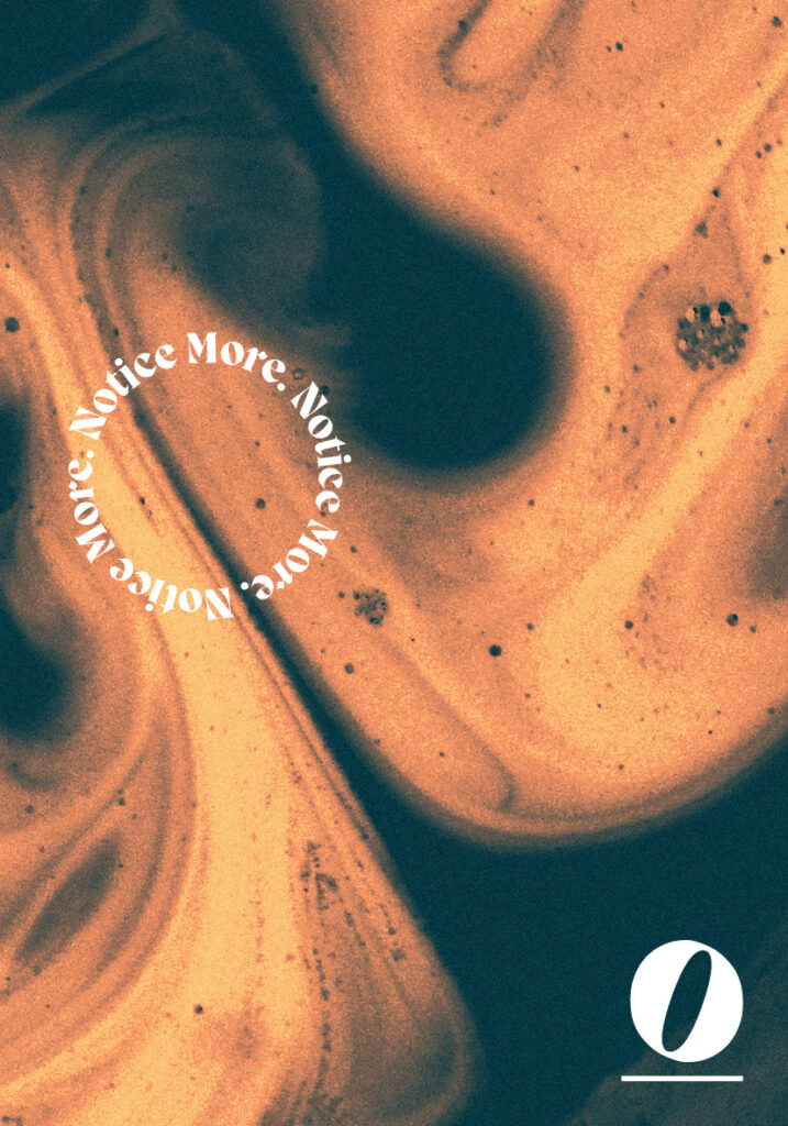
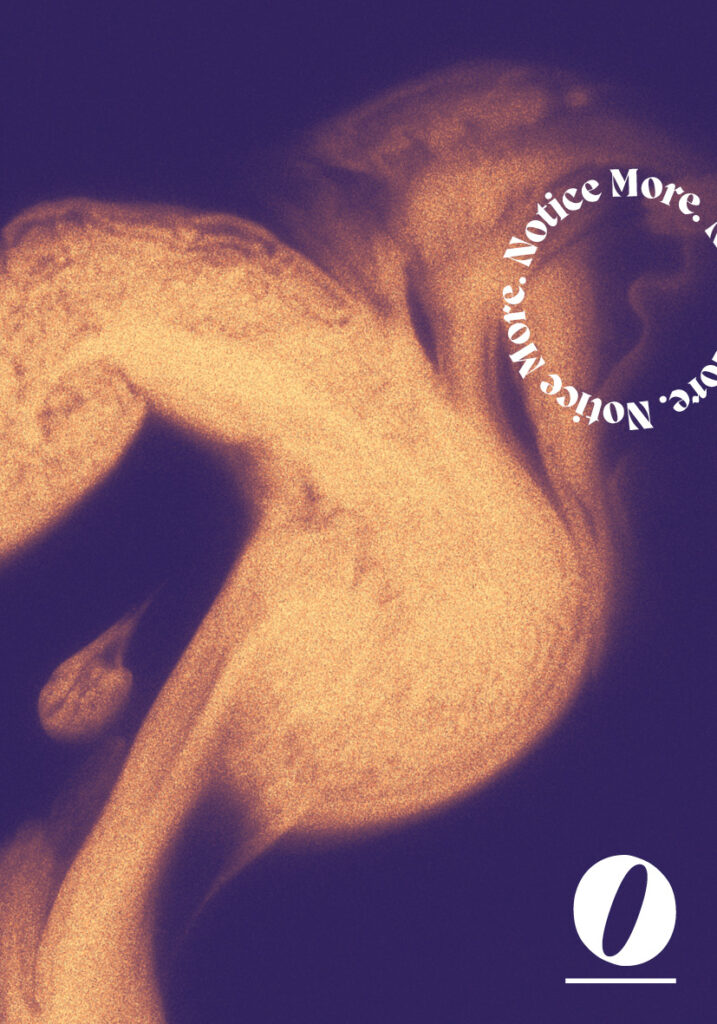
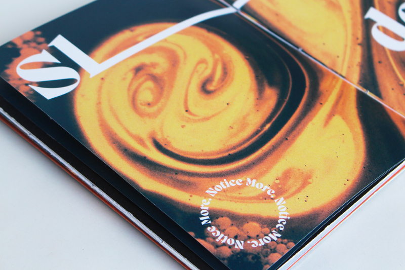
The logo uses the typeface Migra Extra-bold designed by Valerio Monopoli. The words Notice More were chosen in order to use it as a tagline, and to enhance clarity of the intent of the design intervention being: notice more things in life.
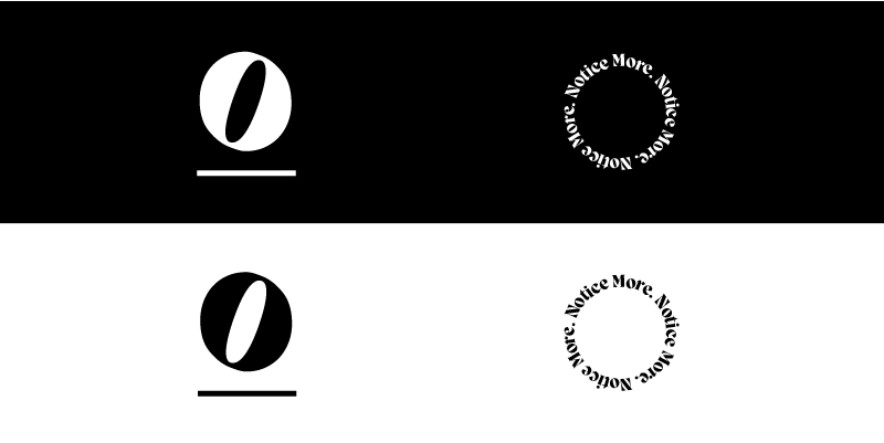
The 'O' on the second word has been mirrored to reflect the idea of noticing small things being different.
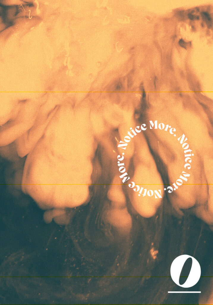
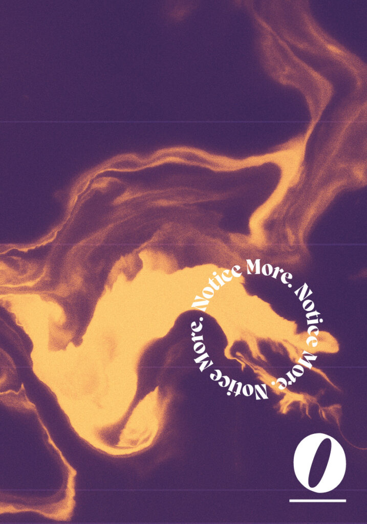
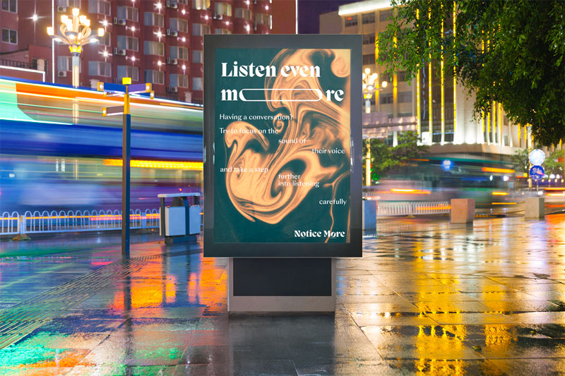
Then as an extension, this 'O' underlined has been used as an alternate of the logo as well as the circle in order to highlight things you can notice within the images