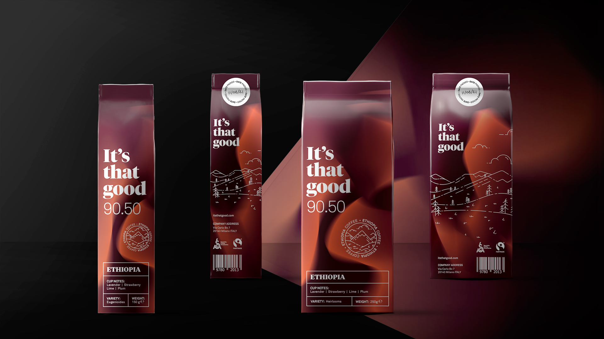
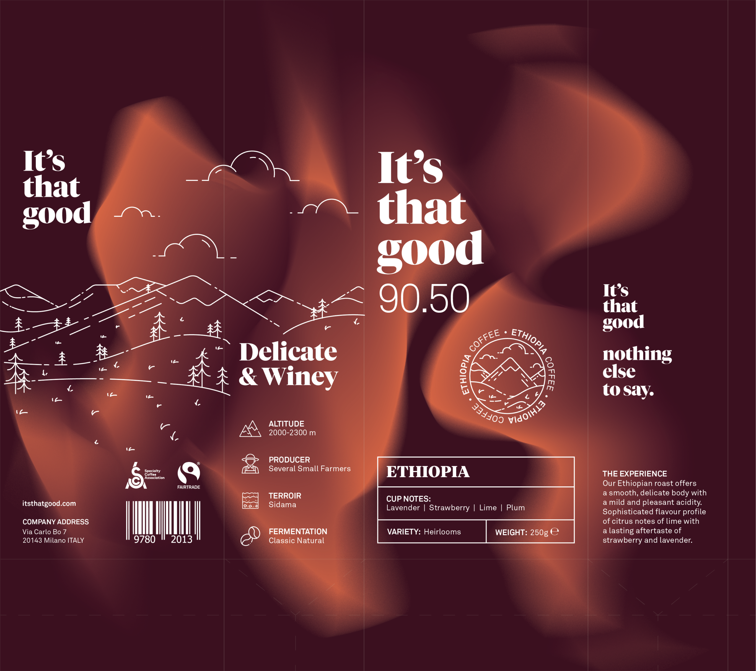
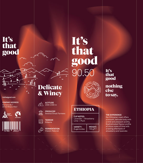
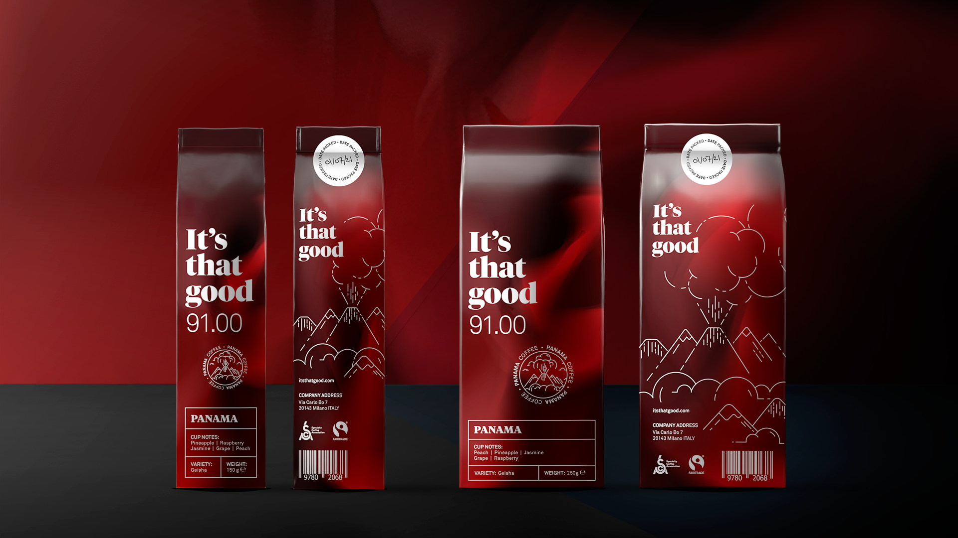
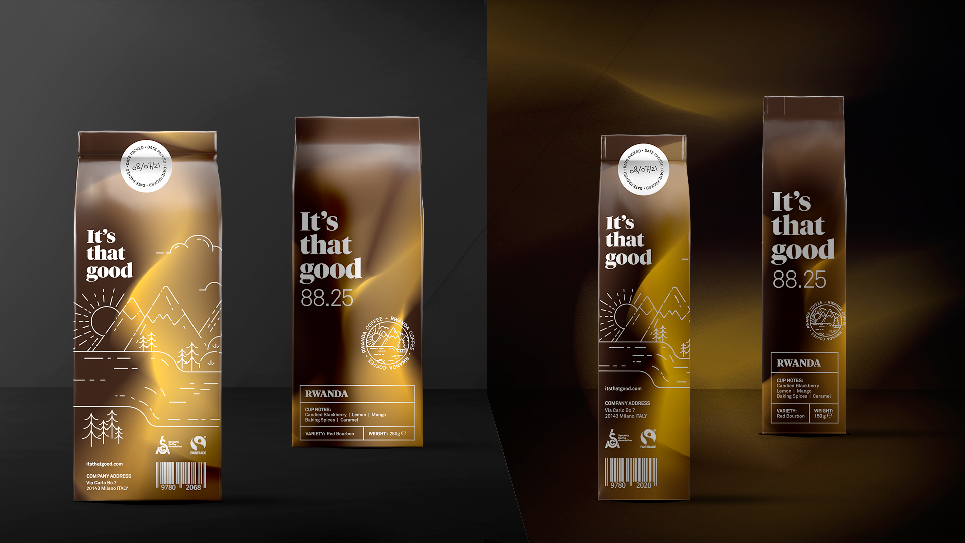
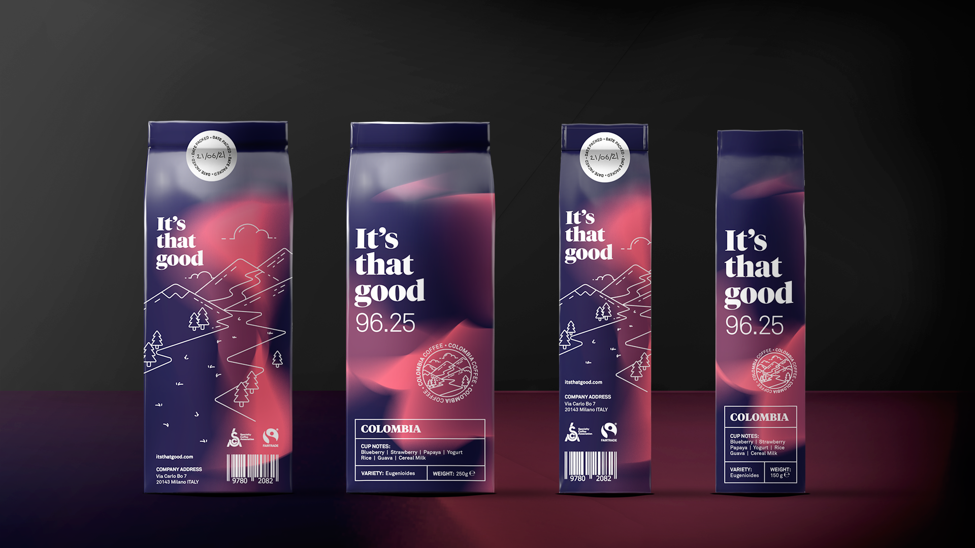
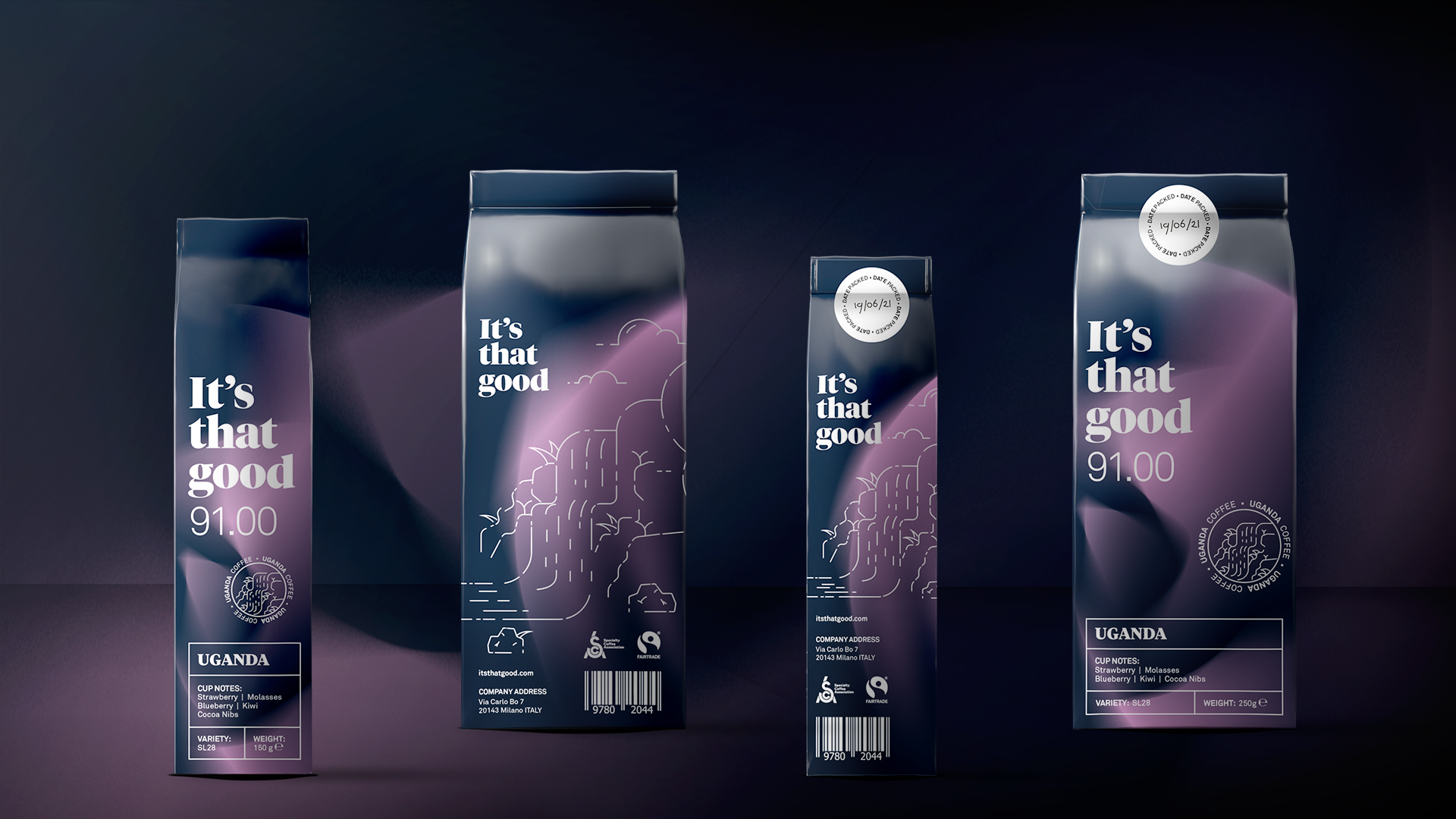
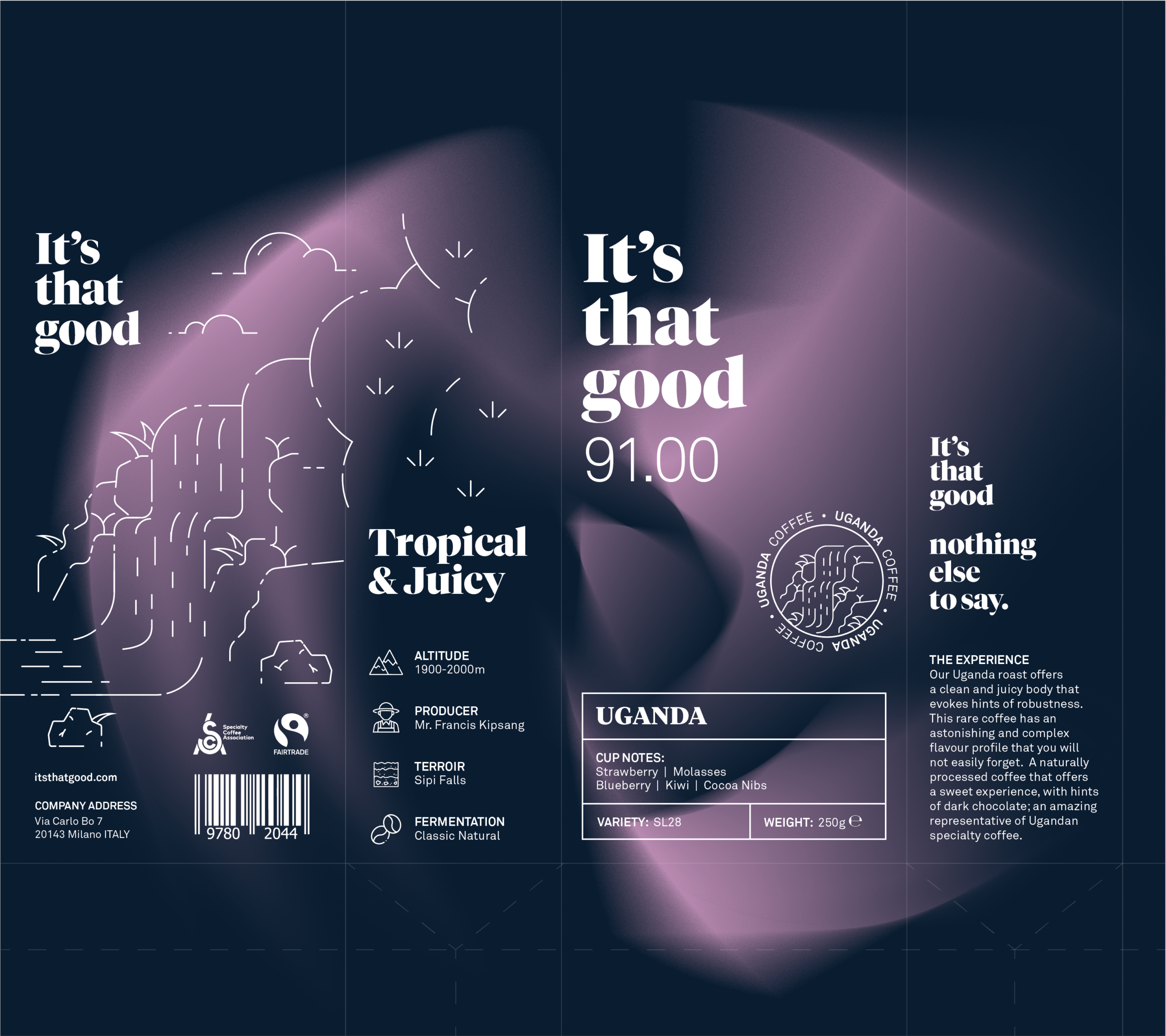
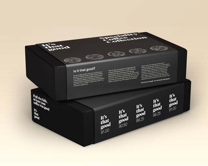
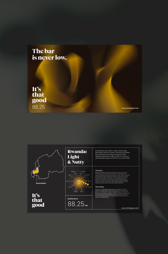
"It's that good" is a fictional specialty coffee brand that is focussed on the quality score of the bean. Both 150 and 250 gram packages were designed.
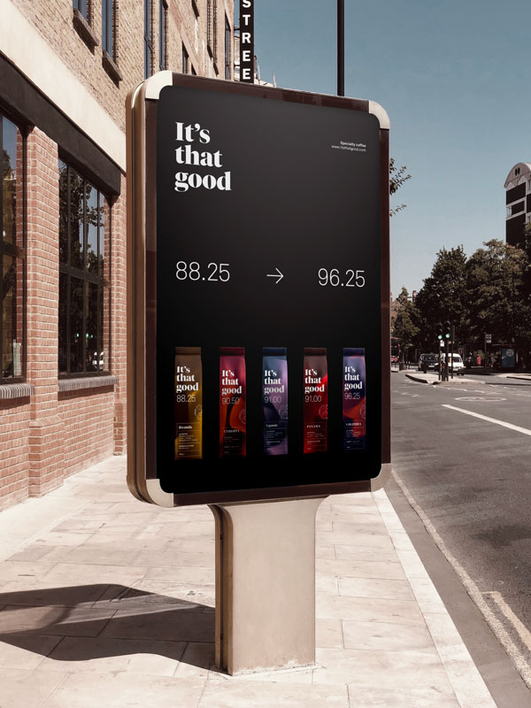
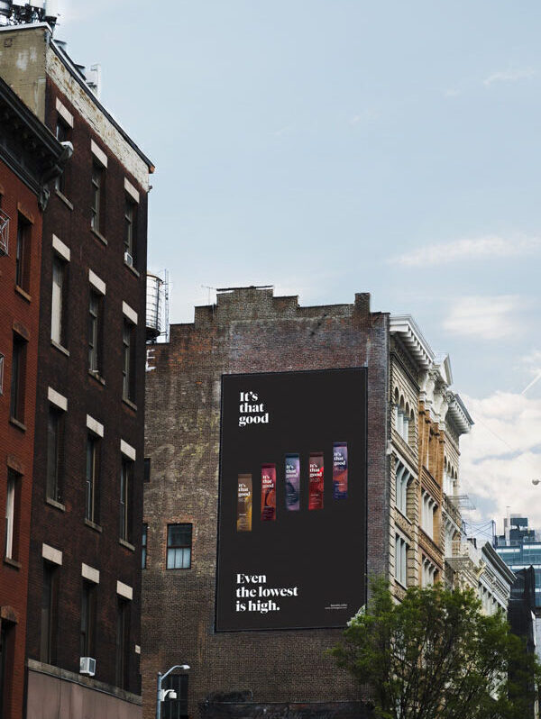
Out of a 100, the score will never be lower than 88.25...because:
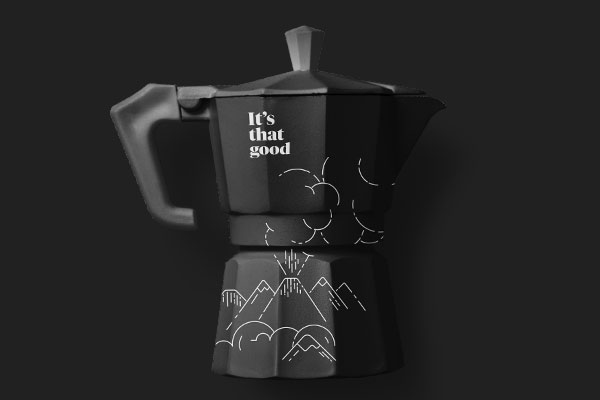
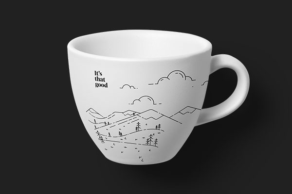
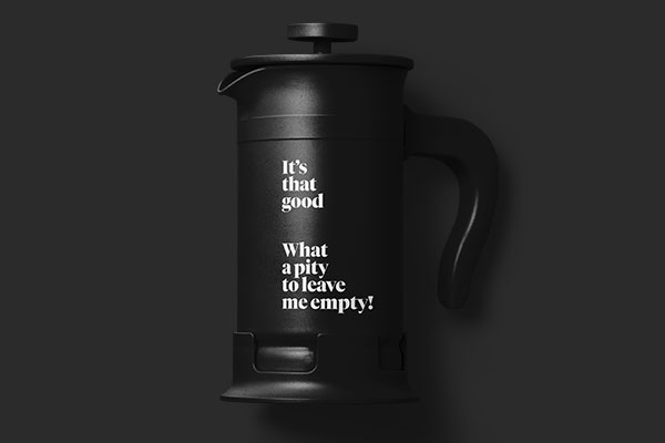
It's that good!
Project Partners: Francesco Rampinini, Yen Ni Liu, Abbie Denton and Crisopher Gelati.
So you choose gradients and drawings?
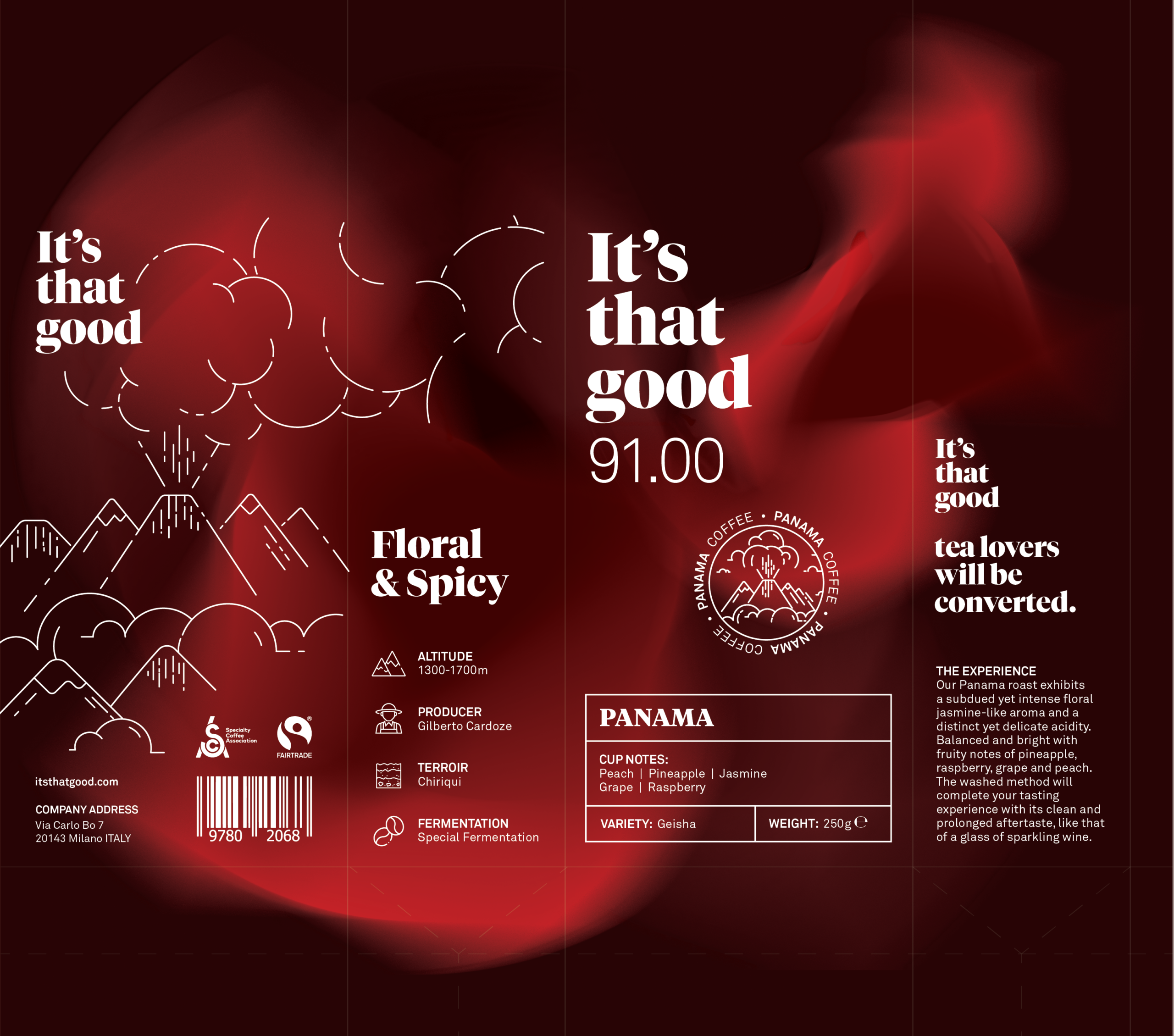
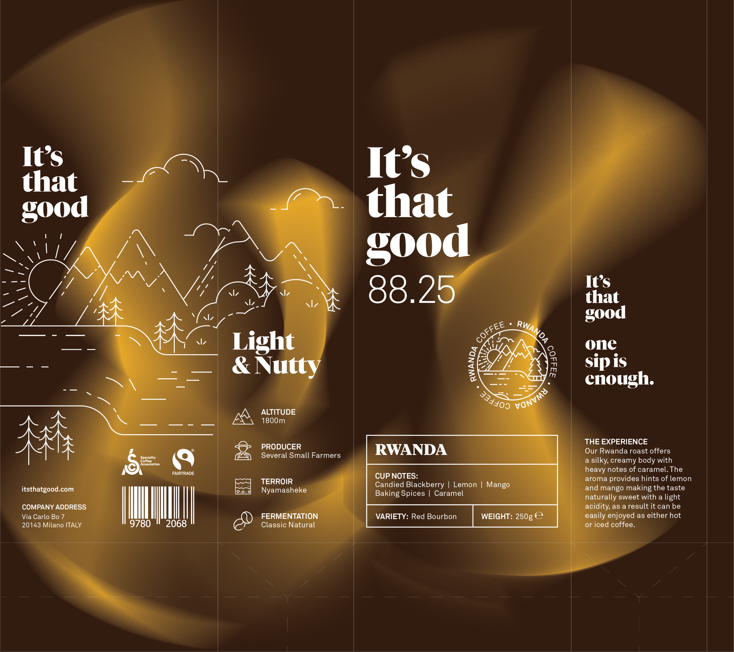
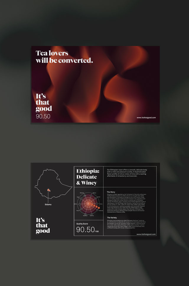
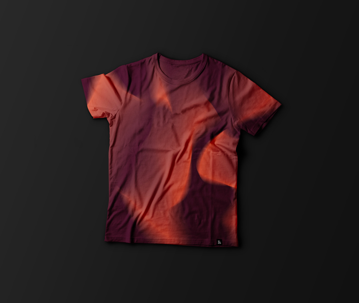
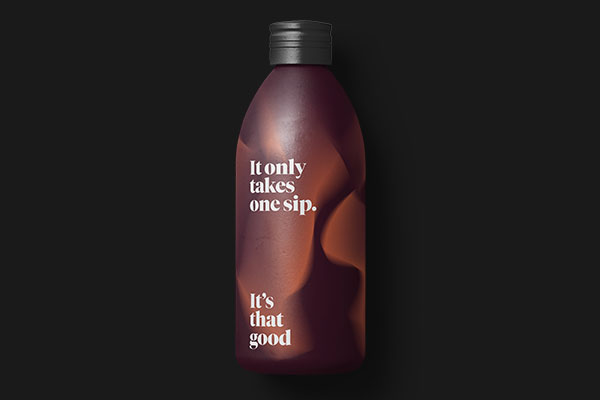
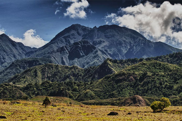
The gradients were inspired by both the notes in the coffee flavour and the origin of the coffee plantations. Such as Panama, a spicy and fruity flavour with notes of peach, pineapple, jasmine, grape and raspberry, from Chiriqui, on the slope of Volcano Baru.
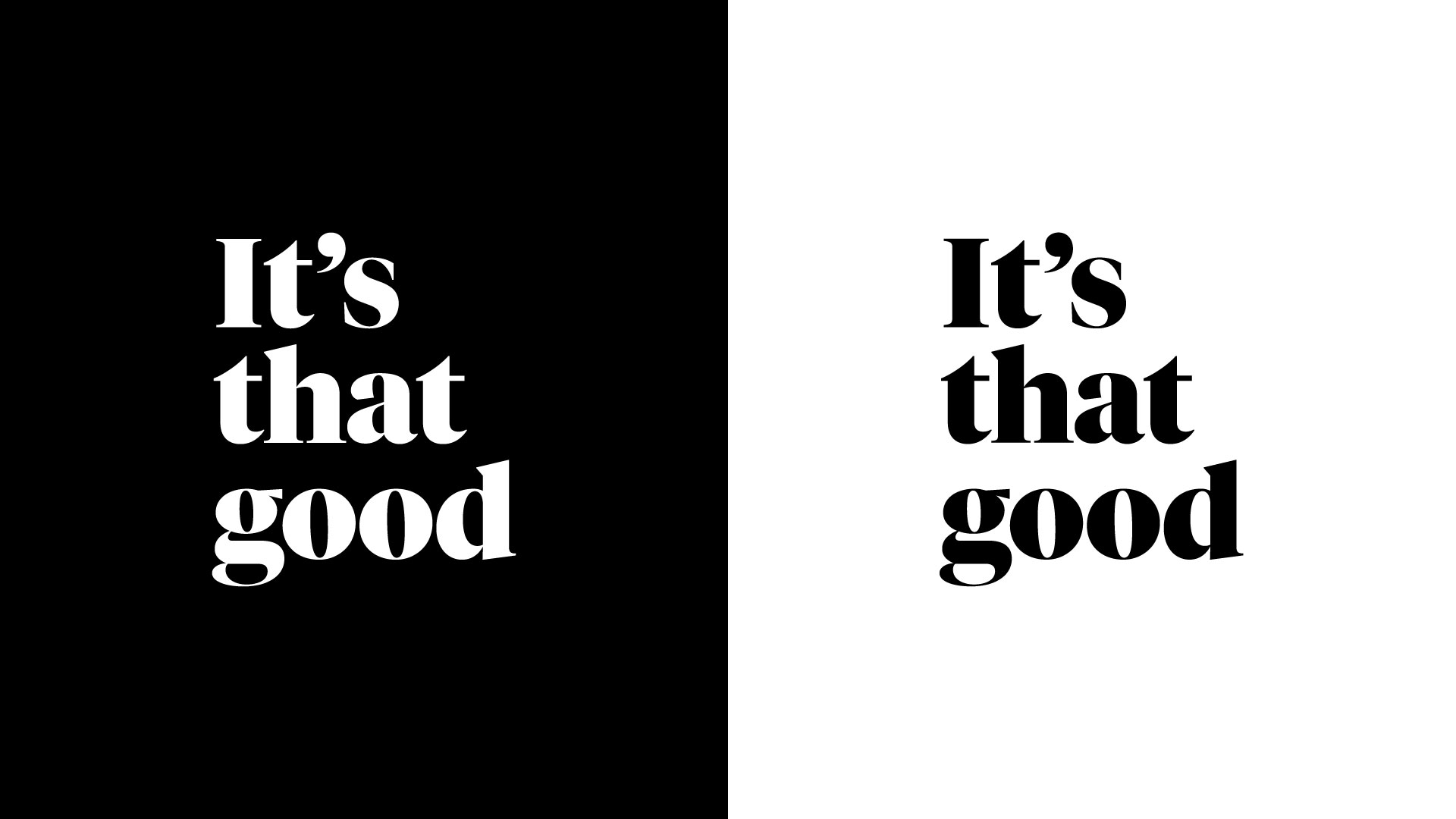
Why the logo on three rows?
Yes, really. The three rows indicate a measuring cup that essentially measured the score of the coffee, always being above 88.25.
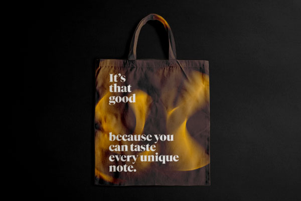
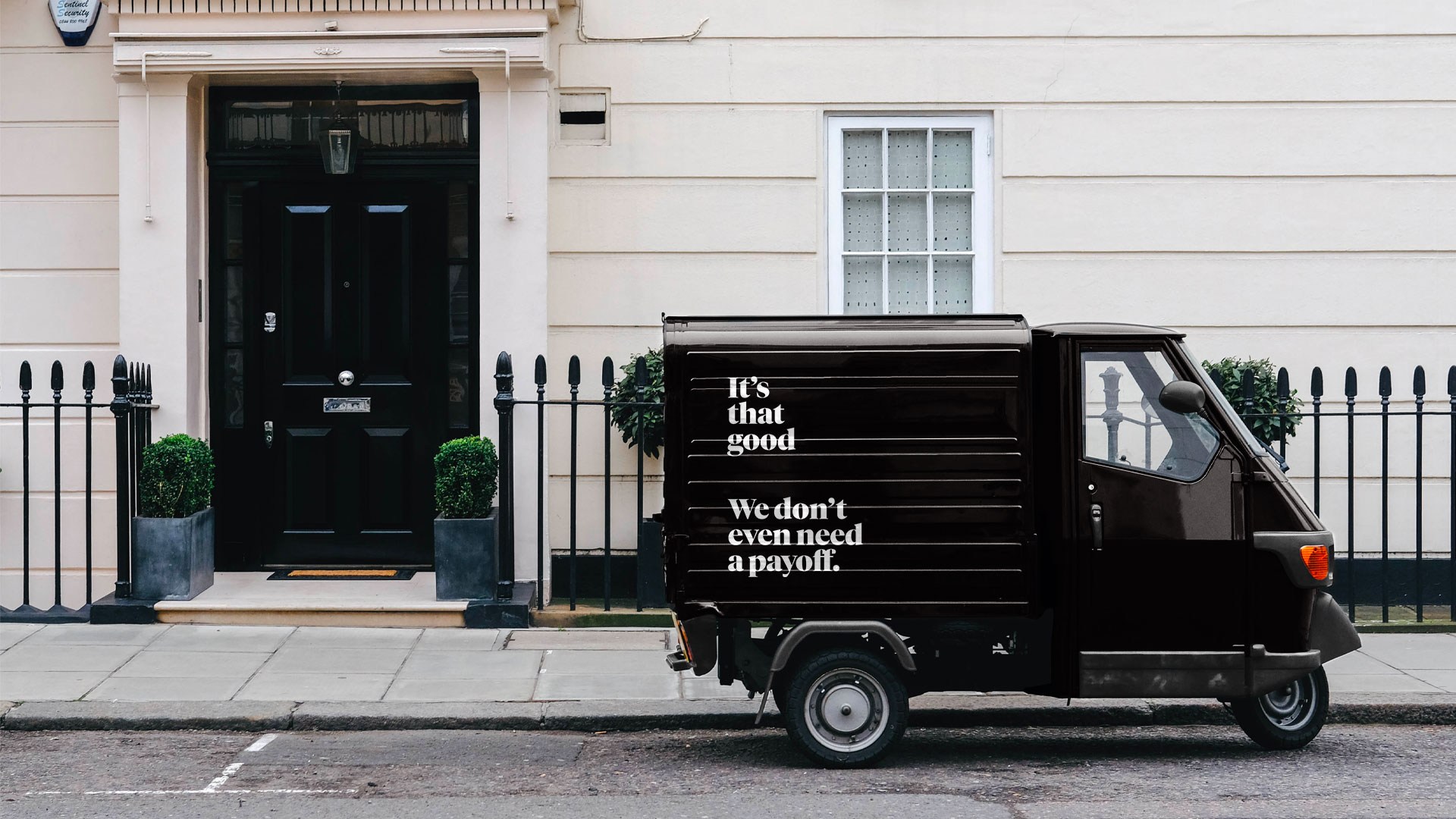
The idea of creating a slightly overly confident and humorous tag line makes this speciality coffee a little less out of reach and emphasizes the tonation: It's. That. Good.
The typeface is Tiemos Fine Black by Klim Type Foundry:
Kris Sowersby and Noe Blanco.
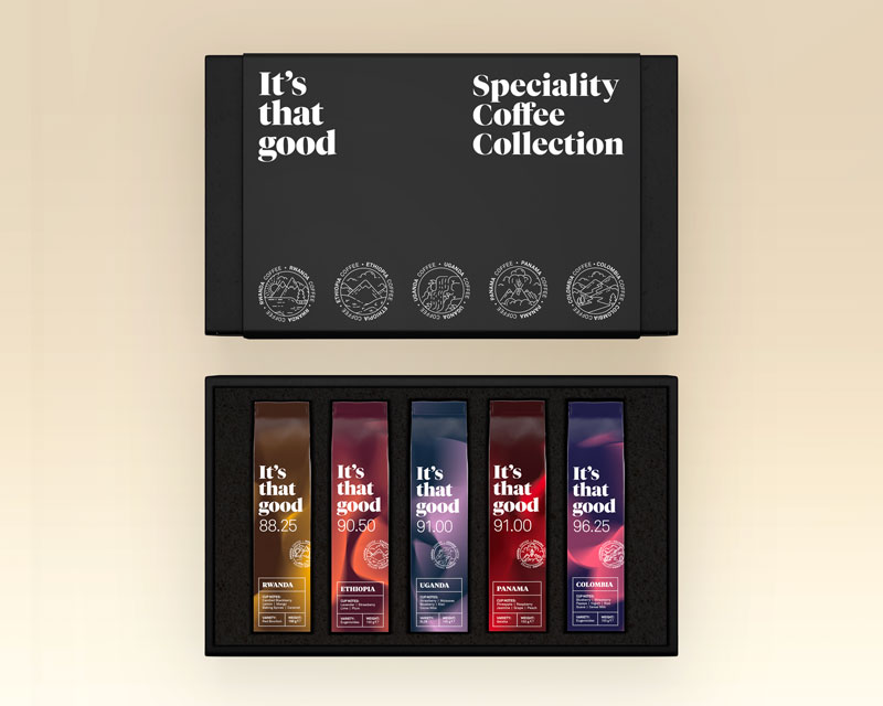
The Specialty Coffee Collection
It's that good, also has a collection of all the five 150gr different types of speciality coffee beans. When opening the box you will find five cards corresponding to the beans with a background story on the origin and the flavour experience.